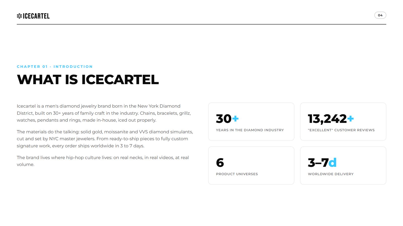
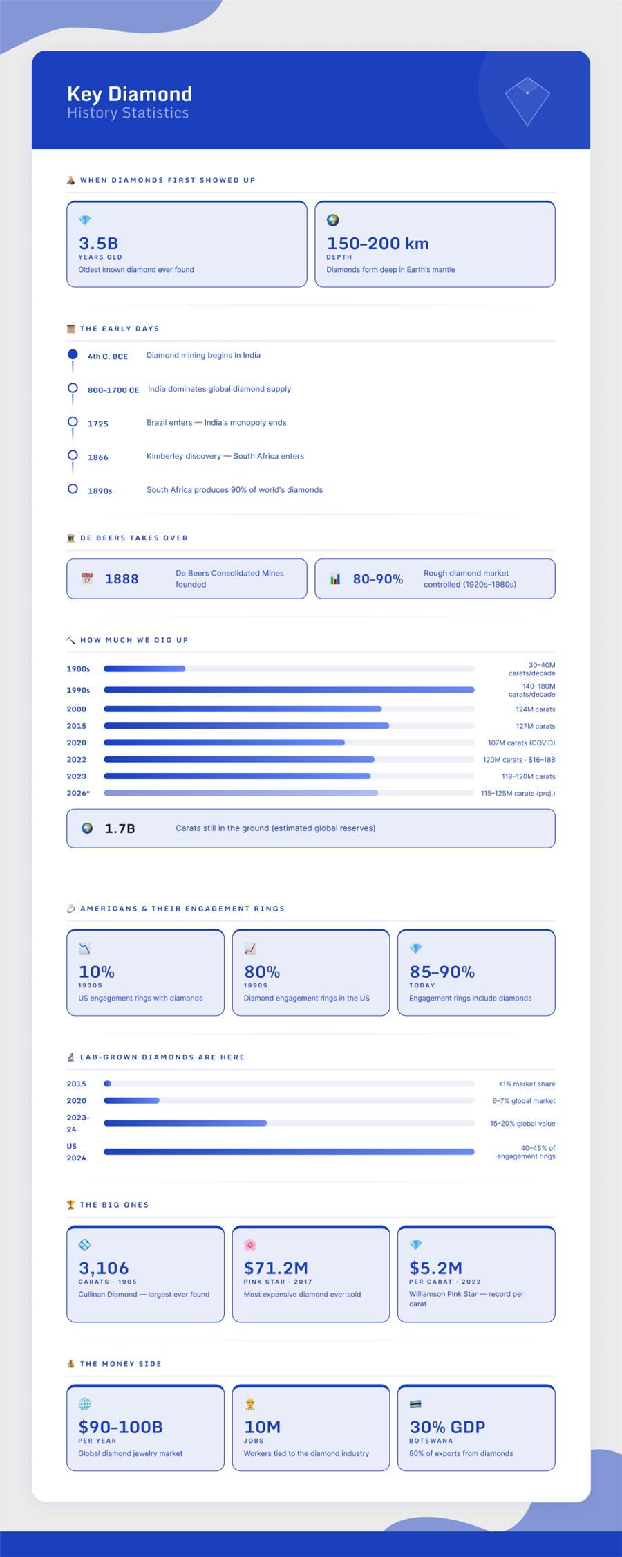
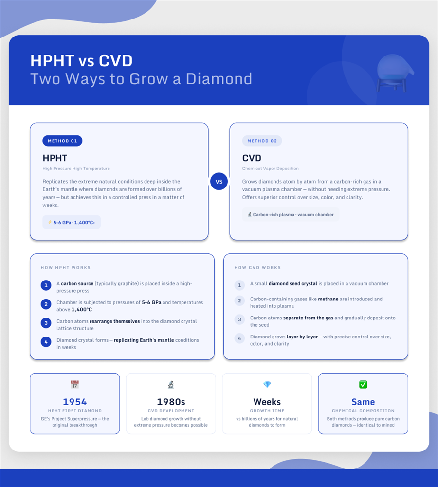
Icecartel sells iced-out jewelry: chains, grillz, watches, pendants, custom pieces, born in the New York Diamond District. This book is the brand's operating system: one typeface, three colors, a 4px grid, and rules strict enough that luxury stays luxury at commerce speed. All 38 pages, exactly as designed.
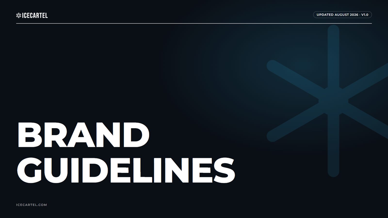
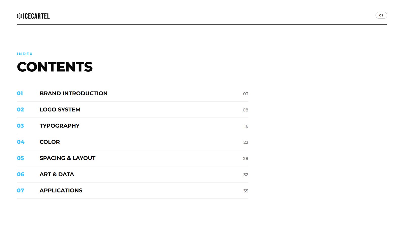
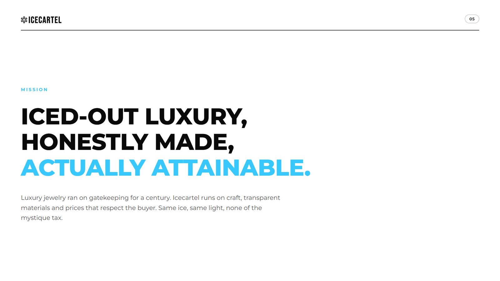
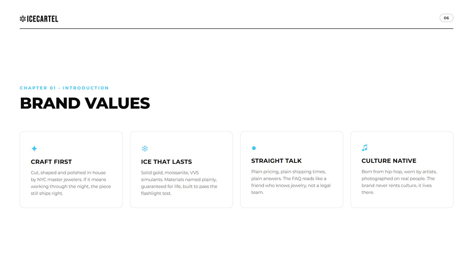
Who Icecartel is, what the brand believes, and how it talks: mission, values, voice, and the uppercase rule that runs through everything.


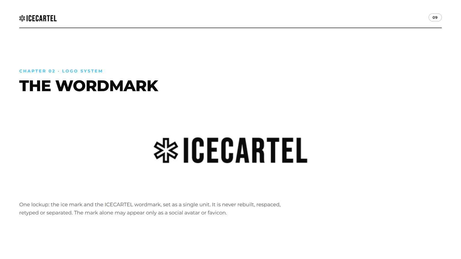
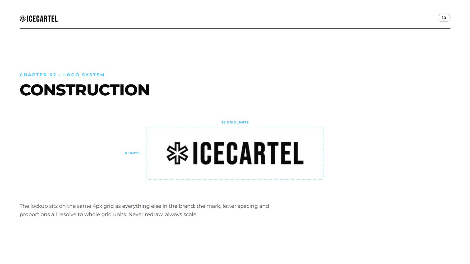
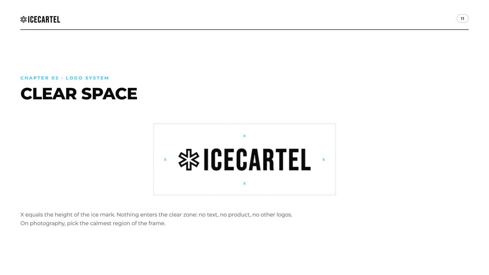
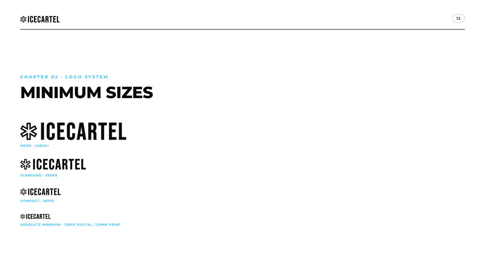
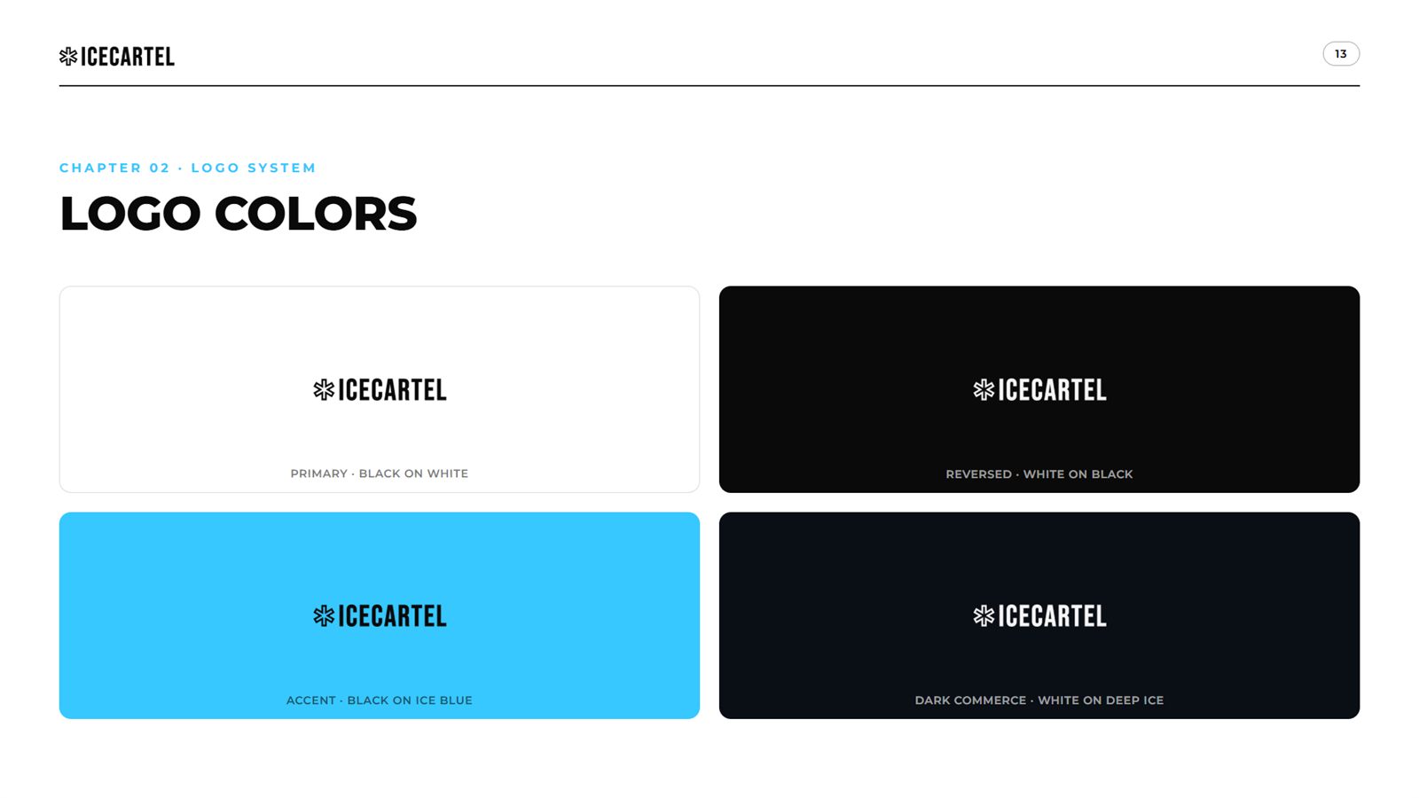
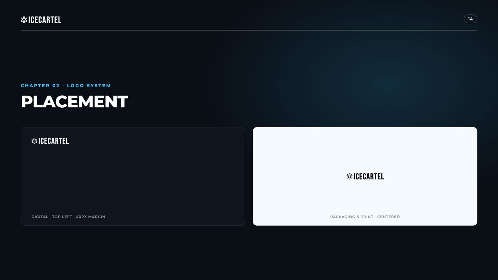
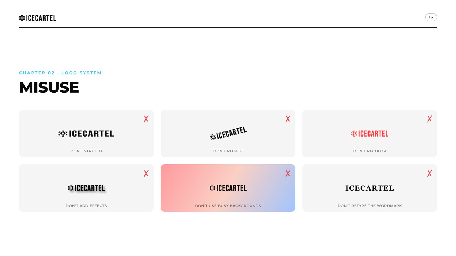
The wordmark as a single sealed unit: construction, clear space, minimum sizes, color variants, placement and the six ways people will try to break it.


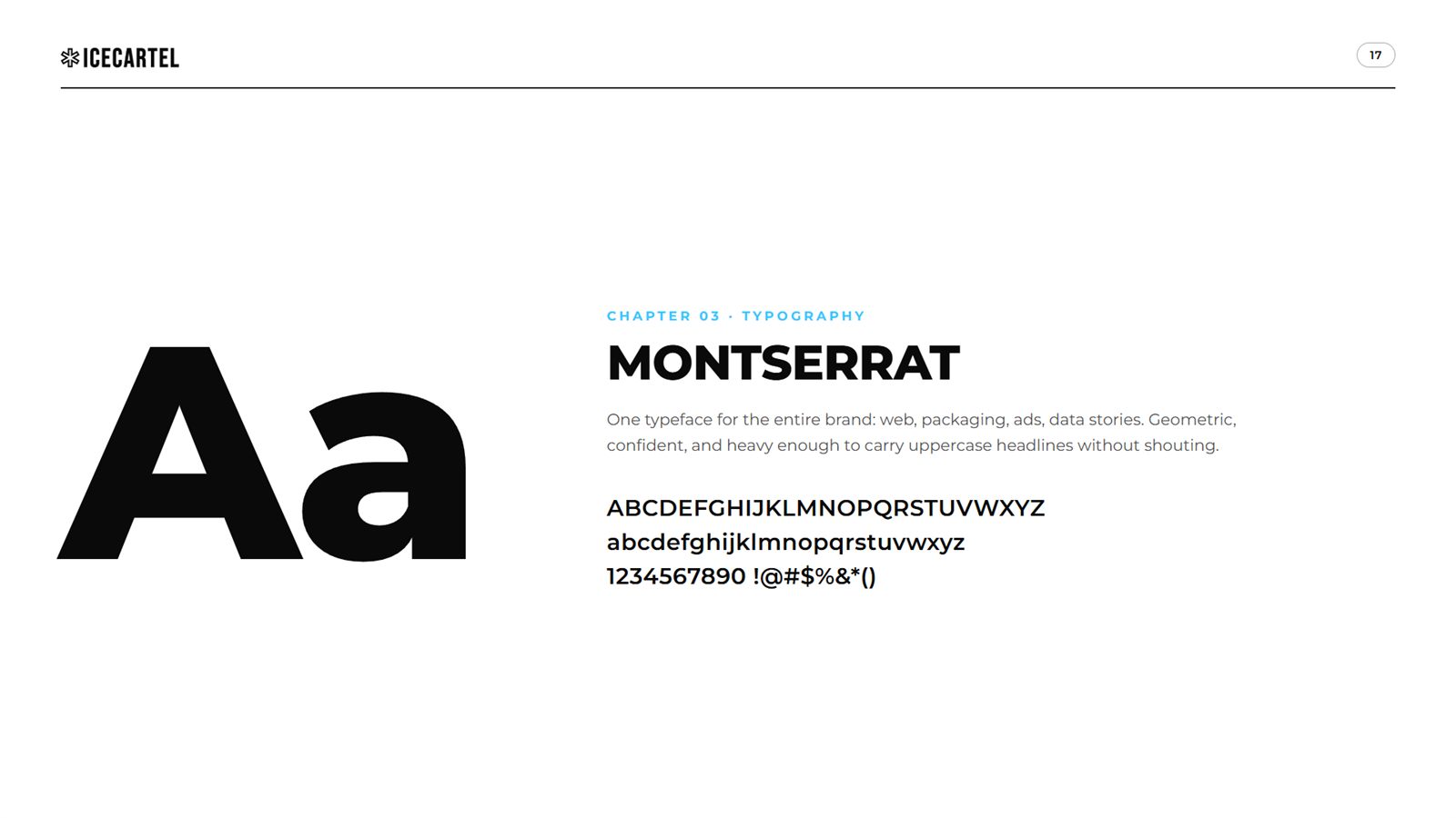
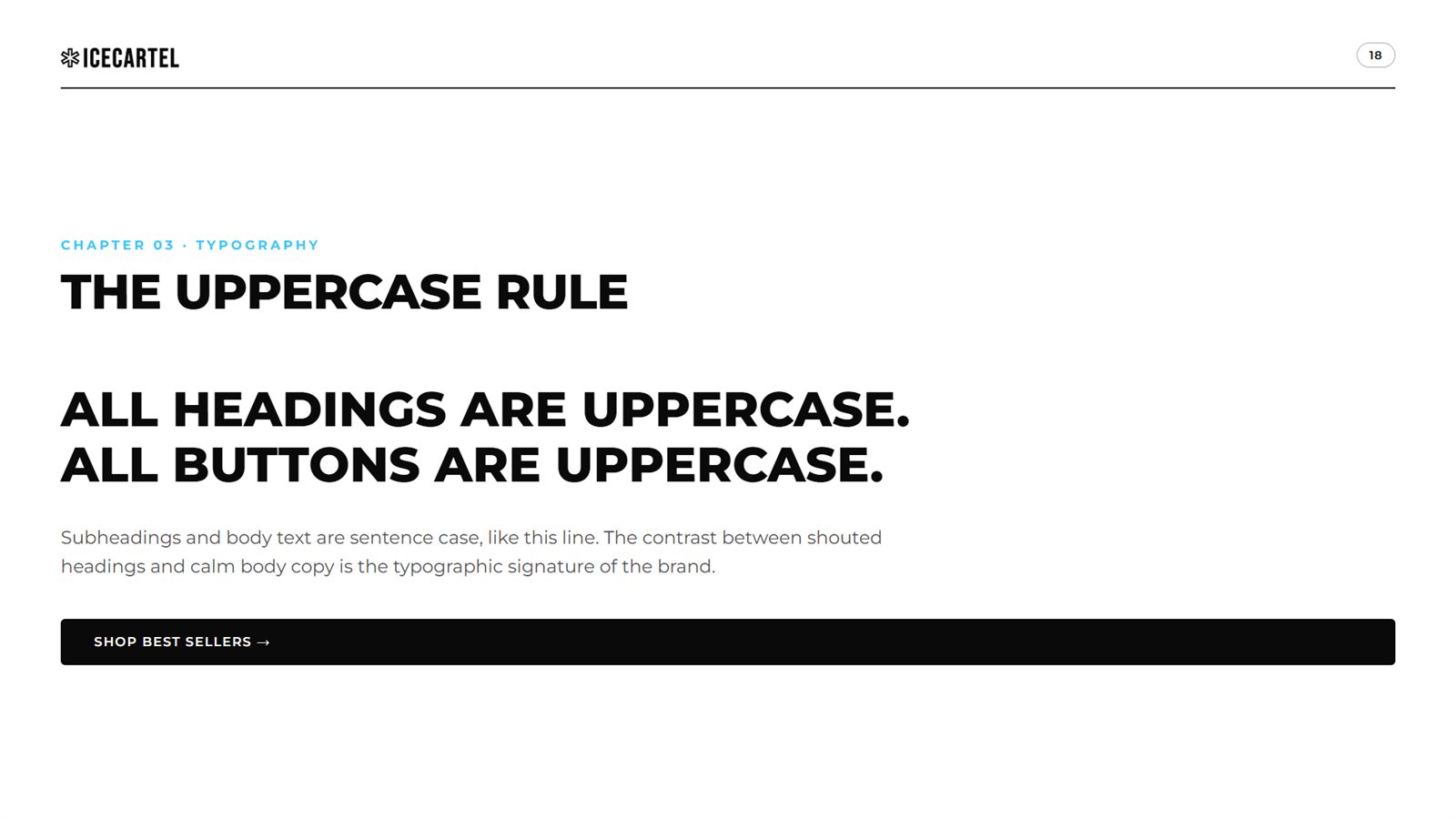
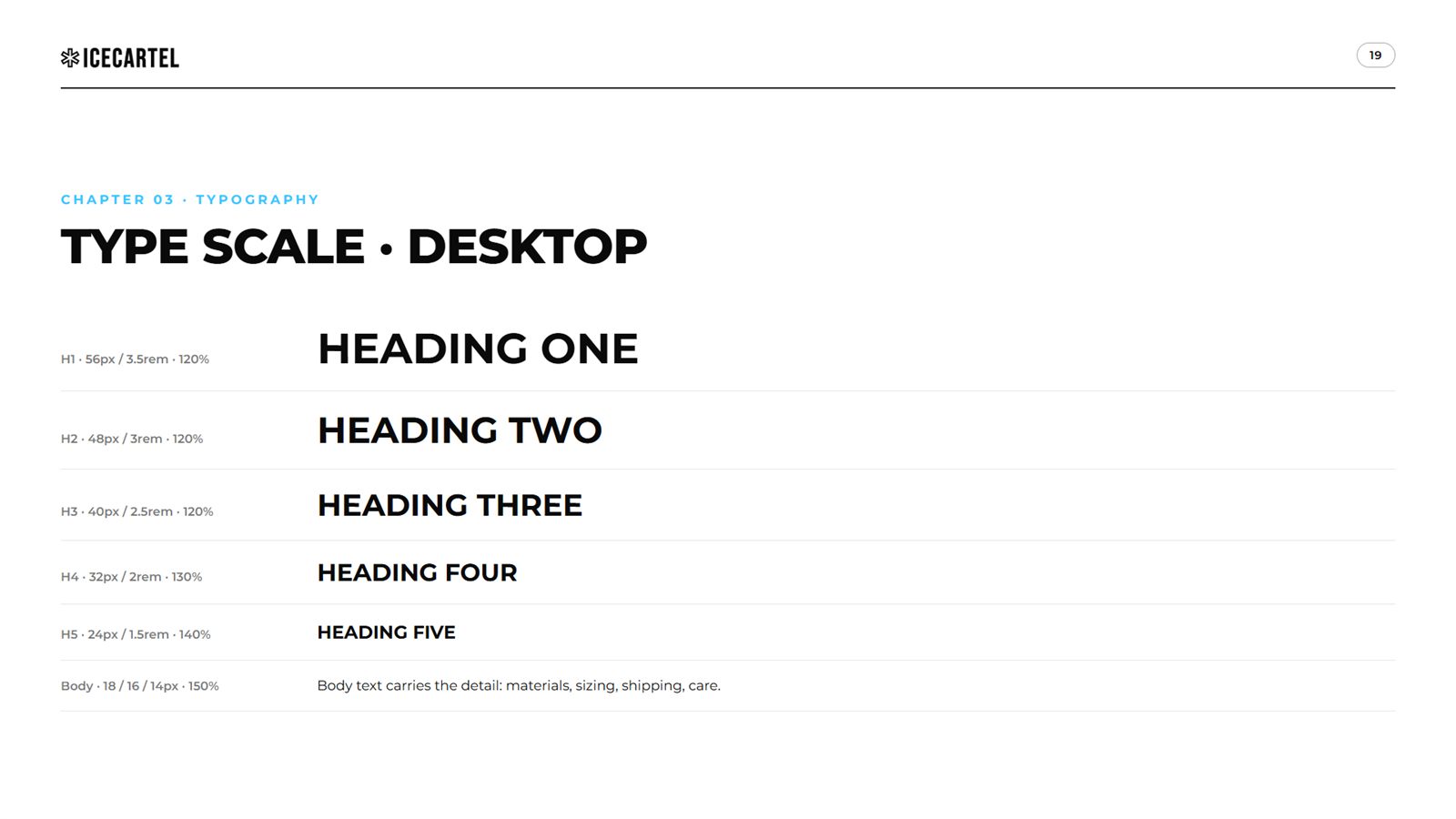
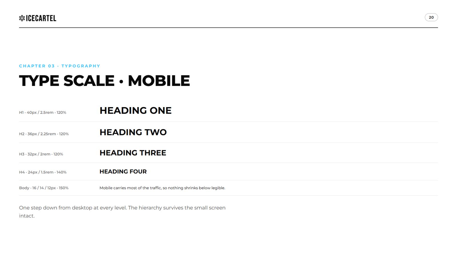
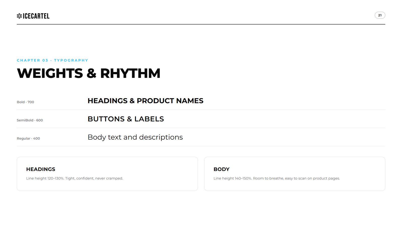
Montserrat carries the entire brand, governed by one loud rule: headings and buttons are uppercase, everything else stays calm.


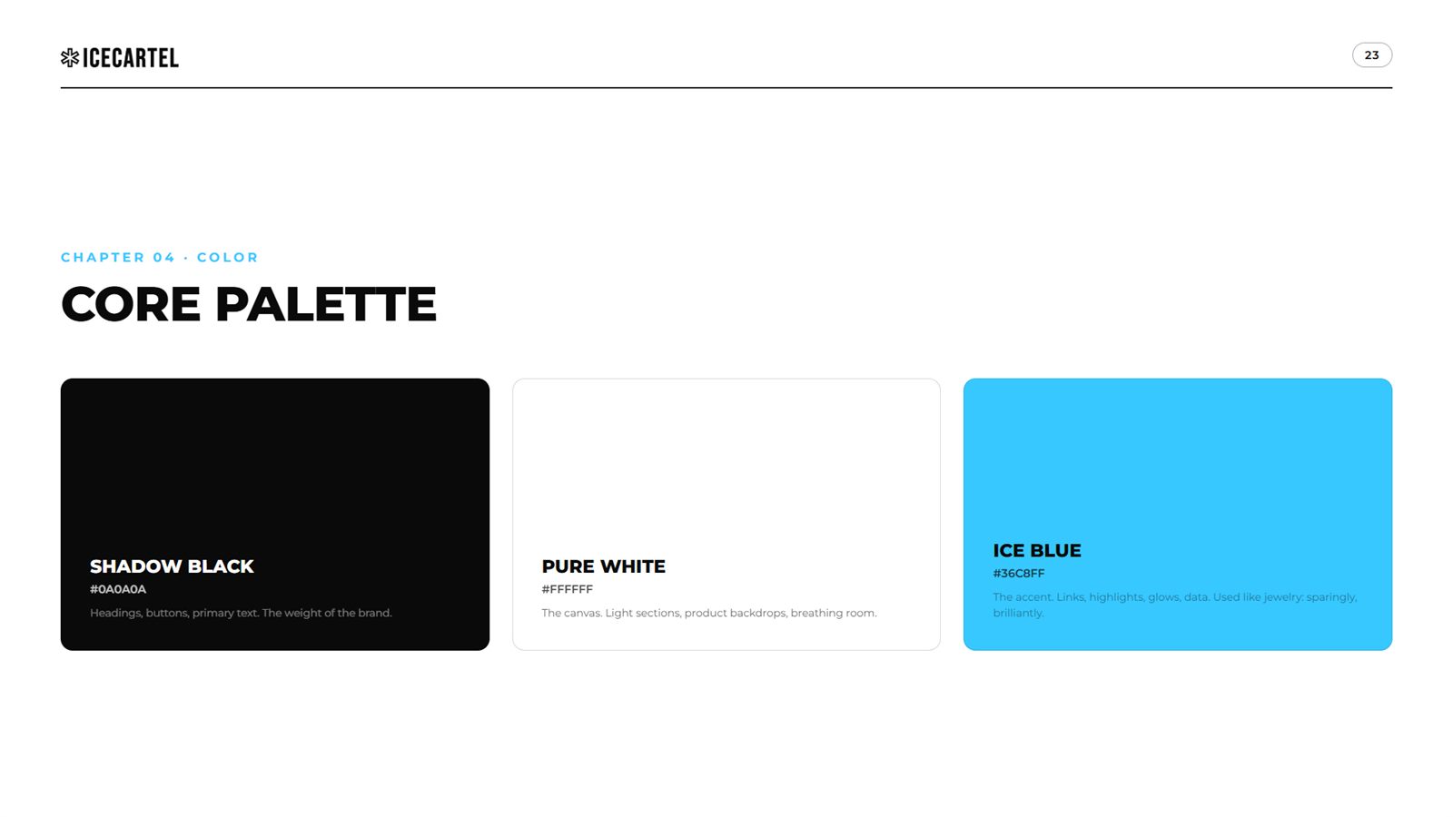
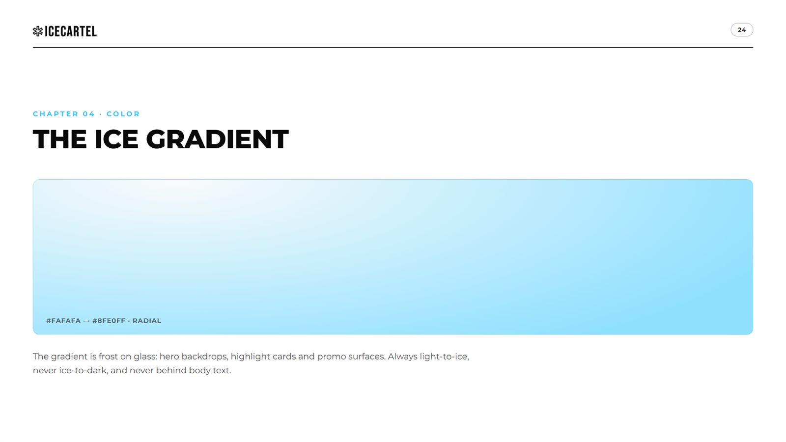
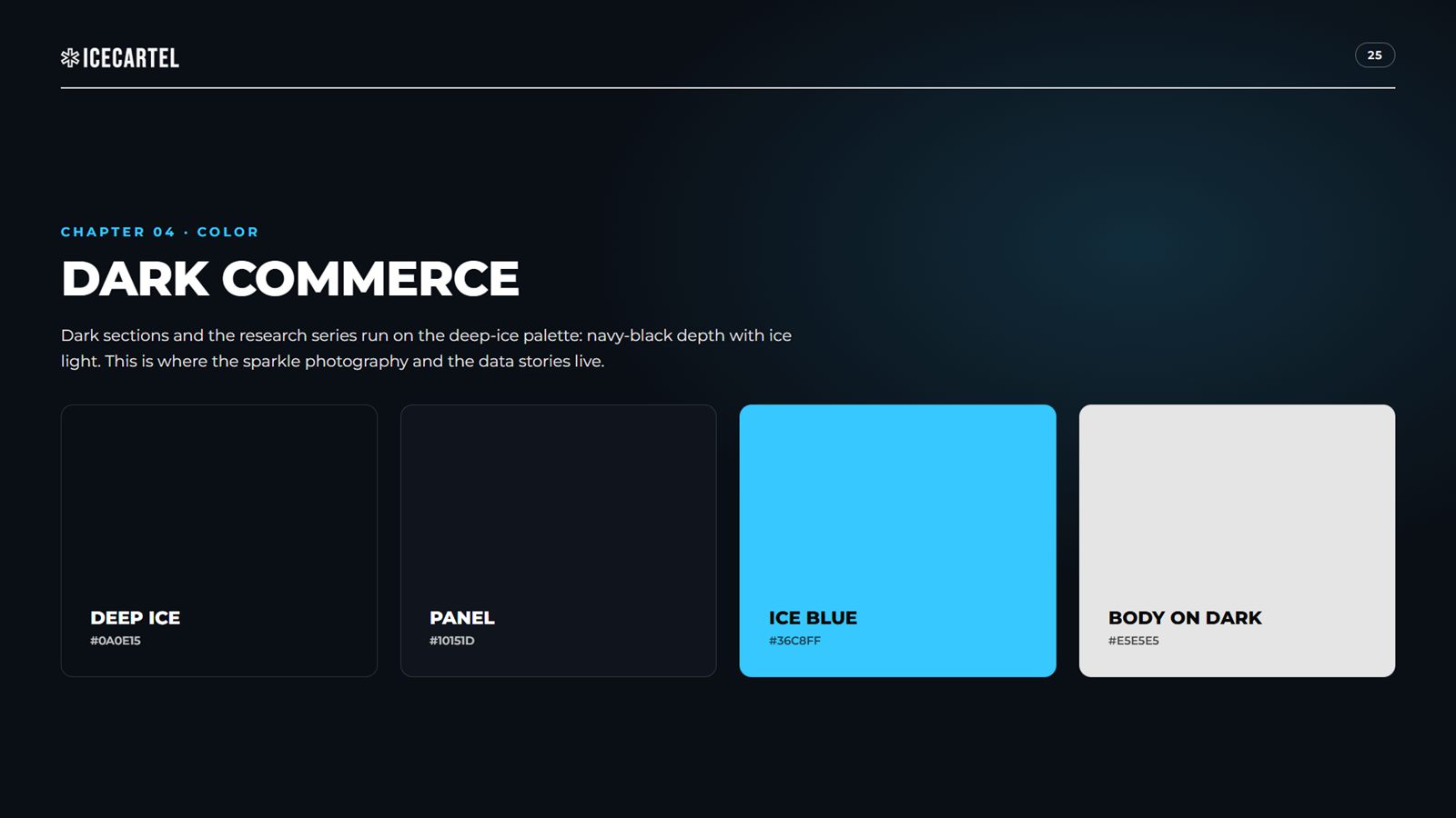
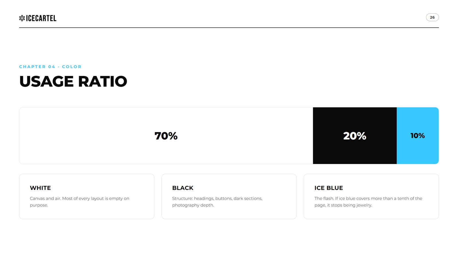
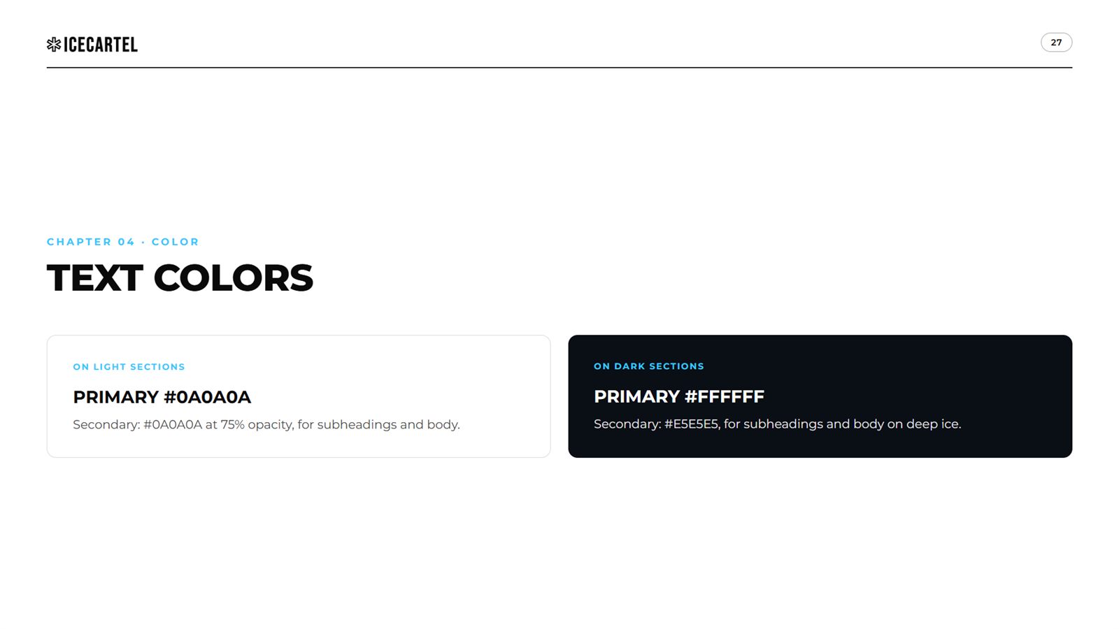
Shadow Black, Pure White, and Ice Blue used like jewelry: sparingly, brilliantly. Plus the frost gradient and the deep-ice dark mode where the data lives.


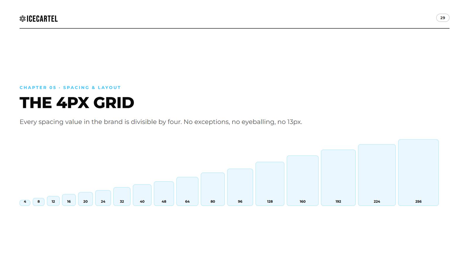
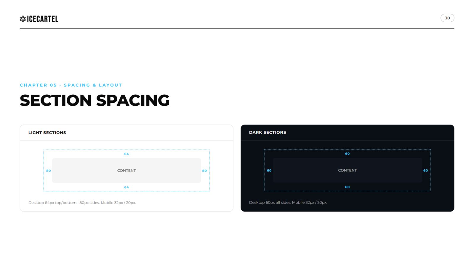
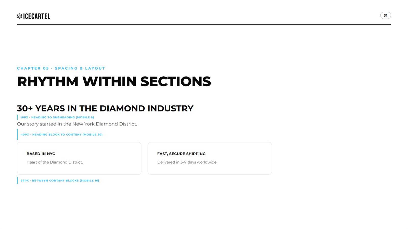
The 4px grid, the section spacing system, and the rhythm rules that keep a dense jewelry catalog feeling like a gallery.


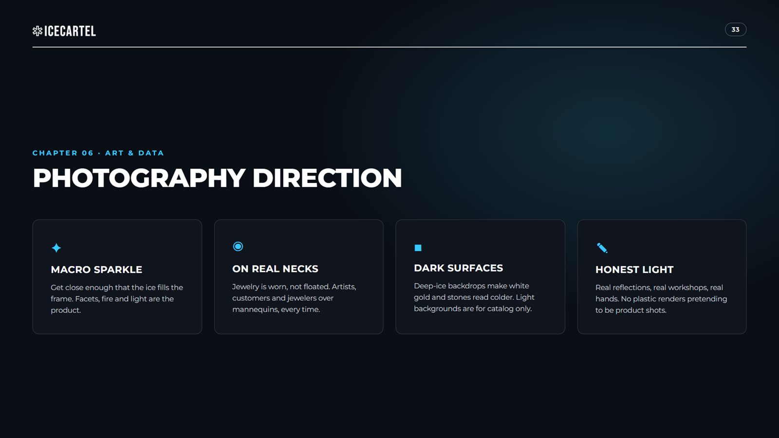
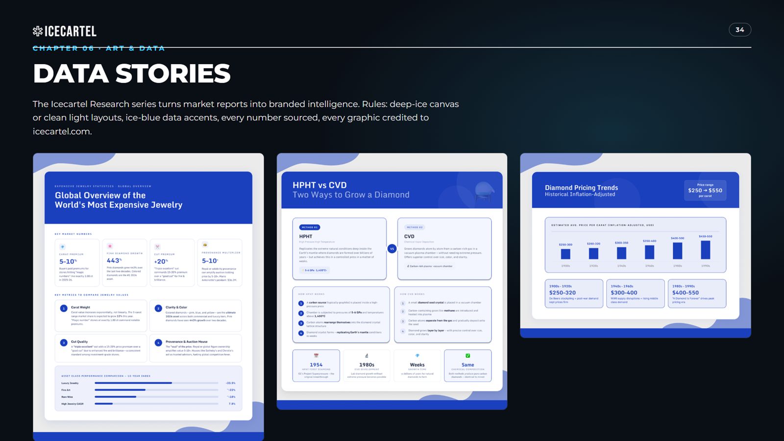
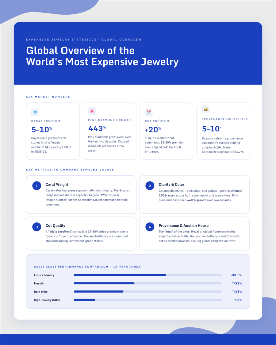
Photography that treats ice as the subject, and the research series that turns market reports into branded authority.

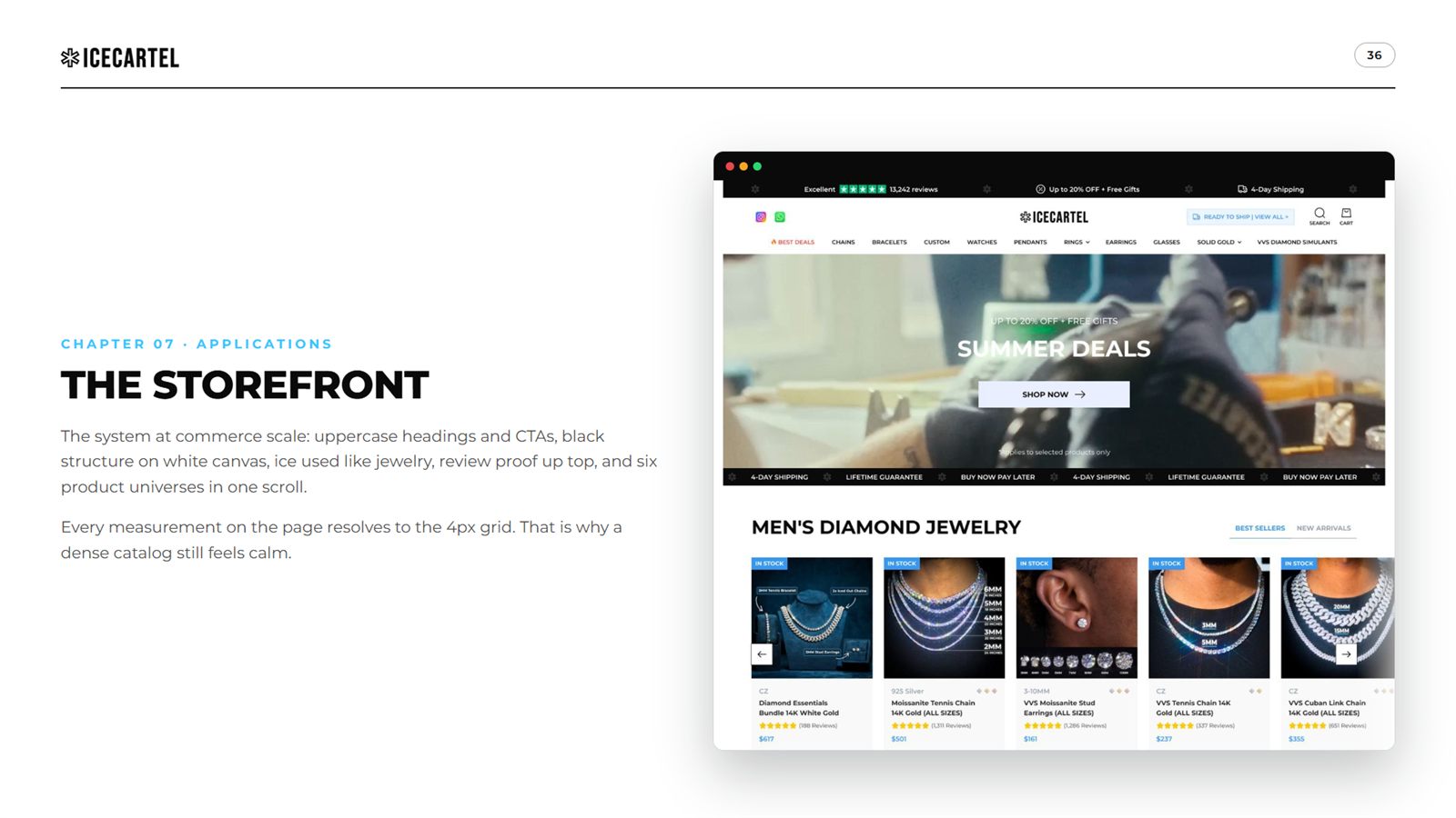
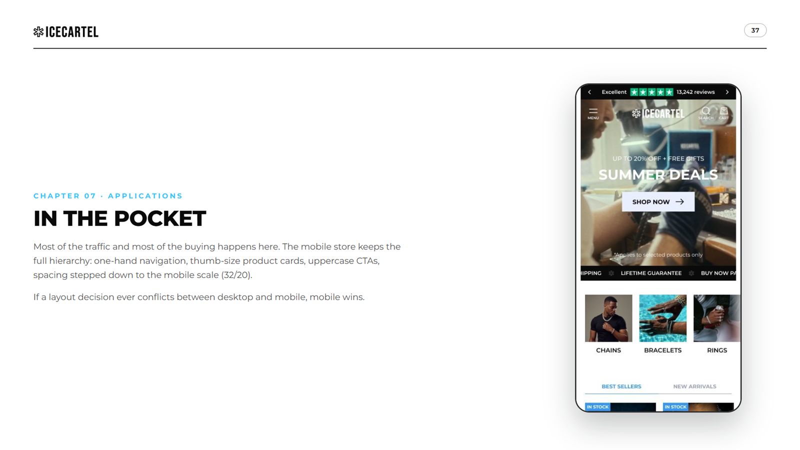
The system leaving the book: storefront, mobile, and the back cover that closes the case.


The system at commerce scale. Six product universes, celebrity proof, a press bar from Vogue to XXL, buy-now-pay-later rails and a custom-jewelry builder. Scroll the store inside the frame.


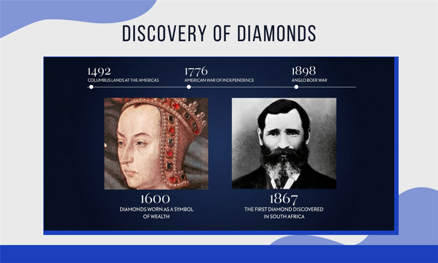
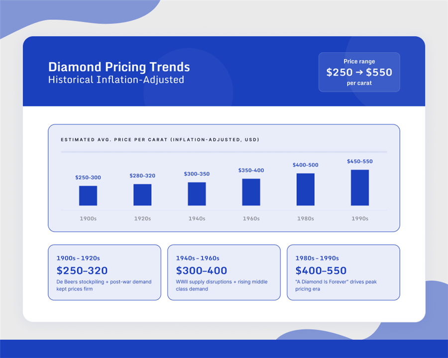
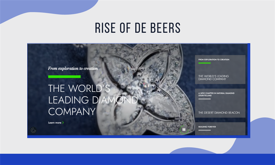
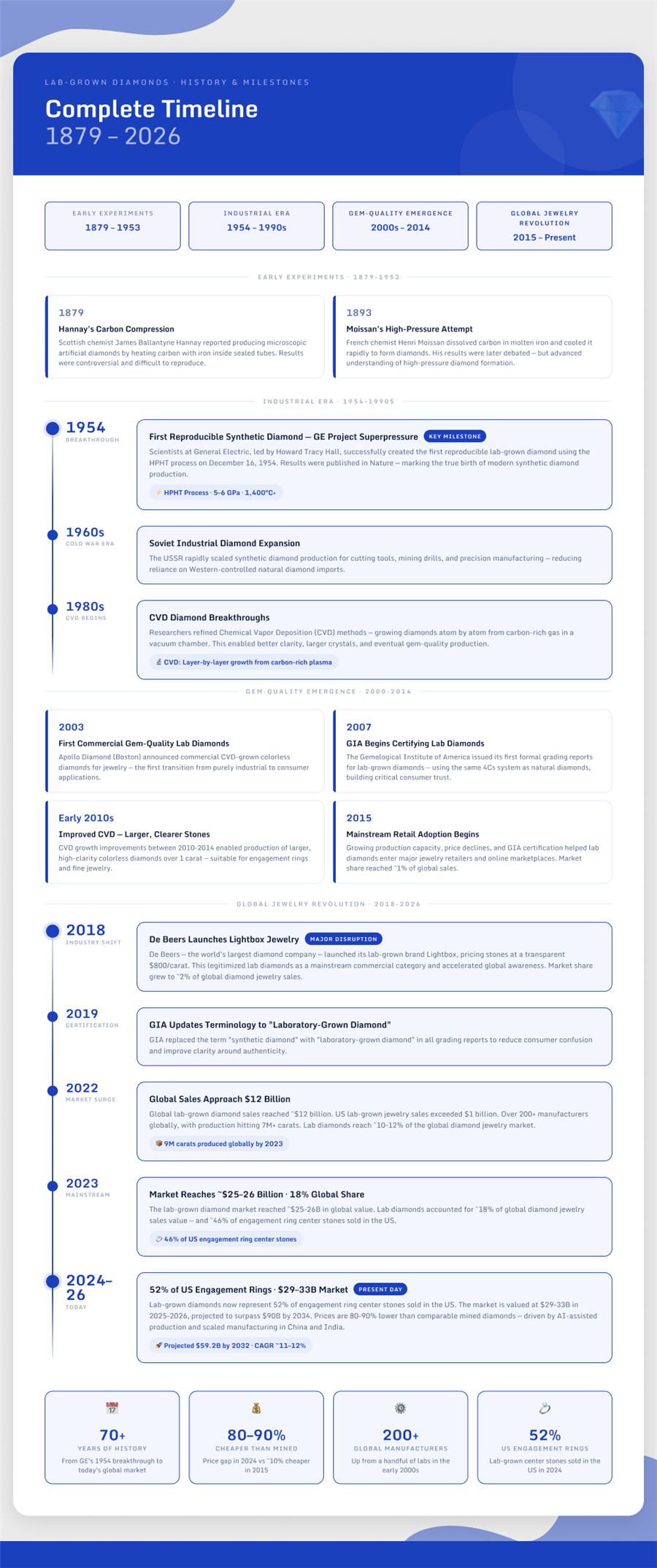
The research series in production: diamond history, the lab-grown disruption, pricing trends and market sizing, each one on-brand down to the last axis label.

A 38-page operating system, a storefront that runs on it, and a research engine that earns the links. That's what a brand book is for: everything after it designs itself.