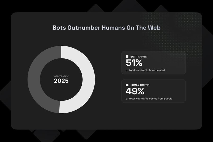
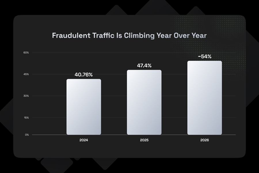
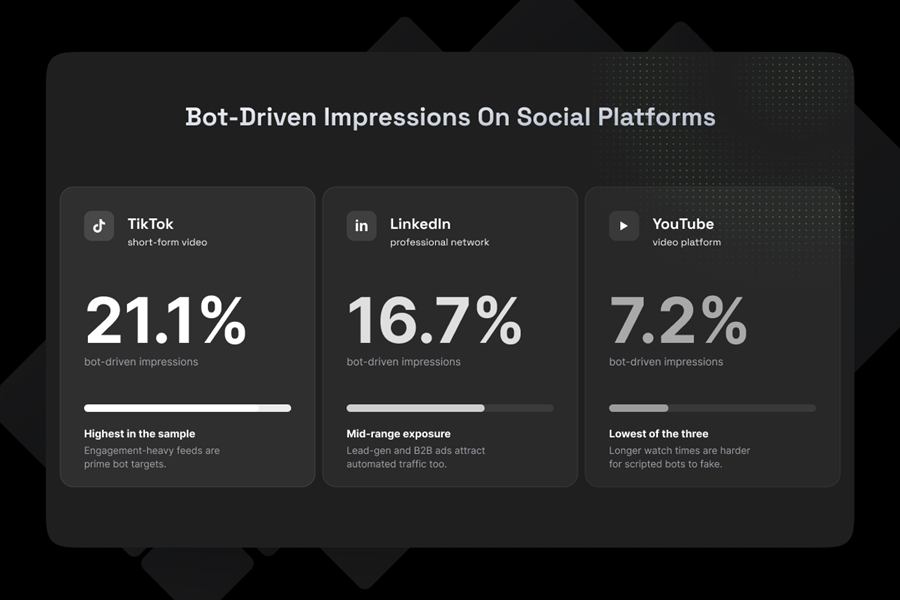
A logo is not a brand. A brand is the system of decisions that makes every future design predictable: how the mark behaves, which colors carry which jobs, what the type does under pressure, how the words sound. This book documents that system for Floxy, a proxy and IP infrastructure brand, thoroughly enough that the brand can run without its designer in the room.

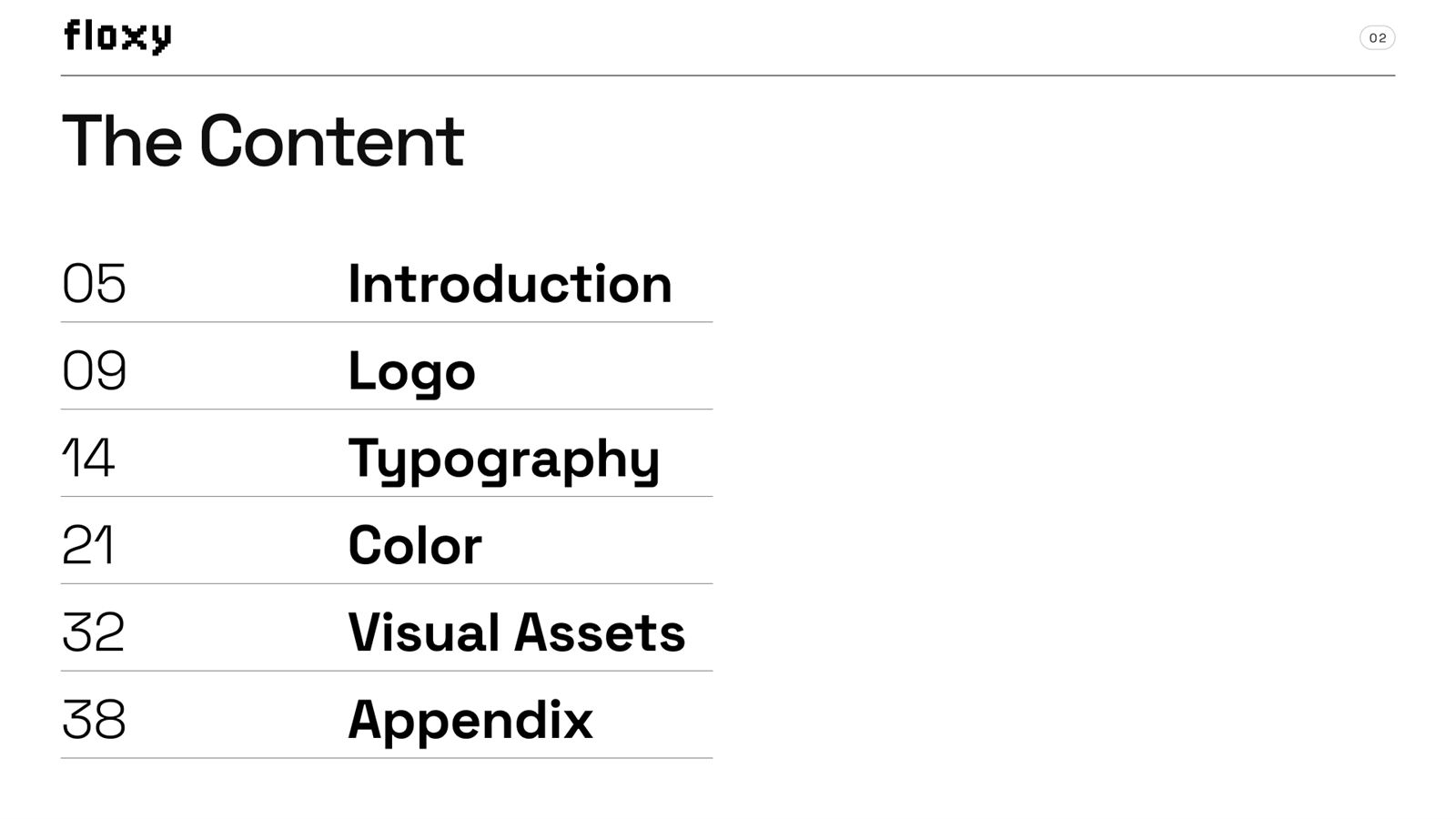
Who Floxy is, what the brand stands for, and the rules of engagement for everything that follows.
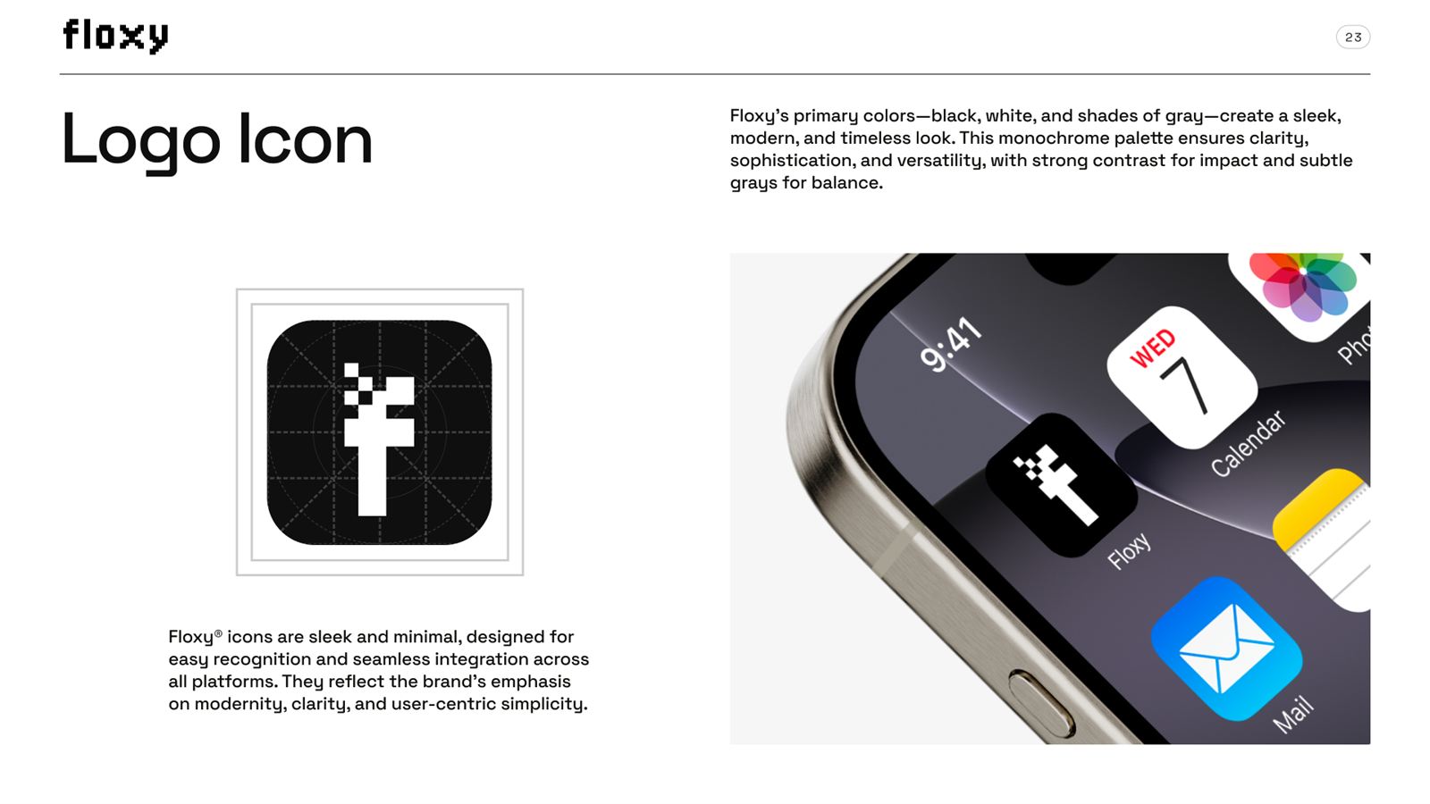
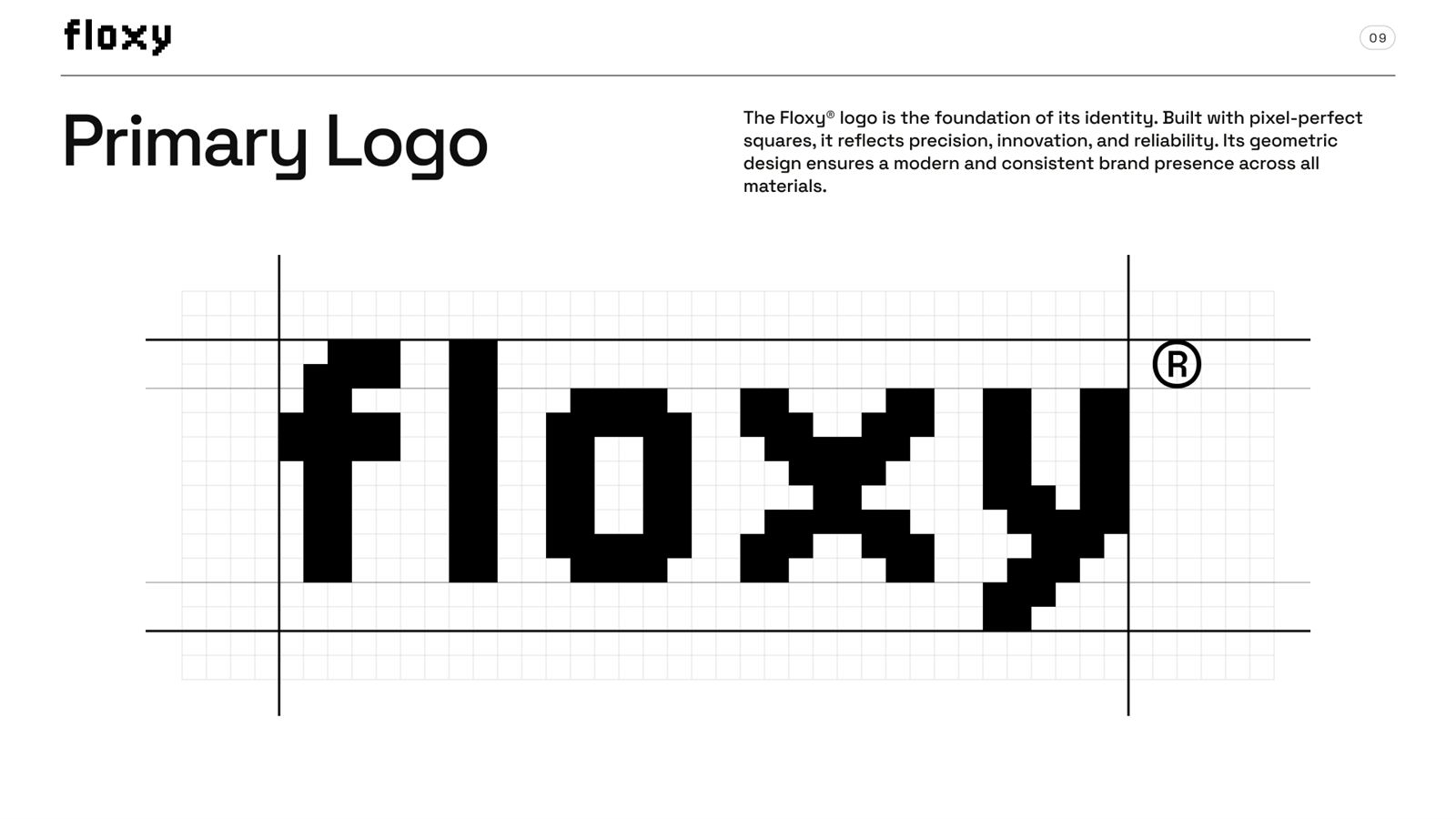
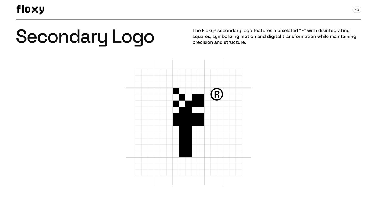
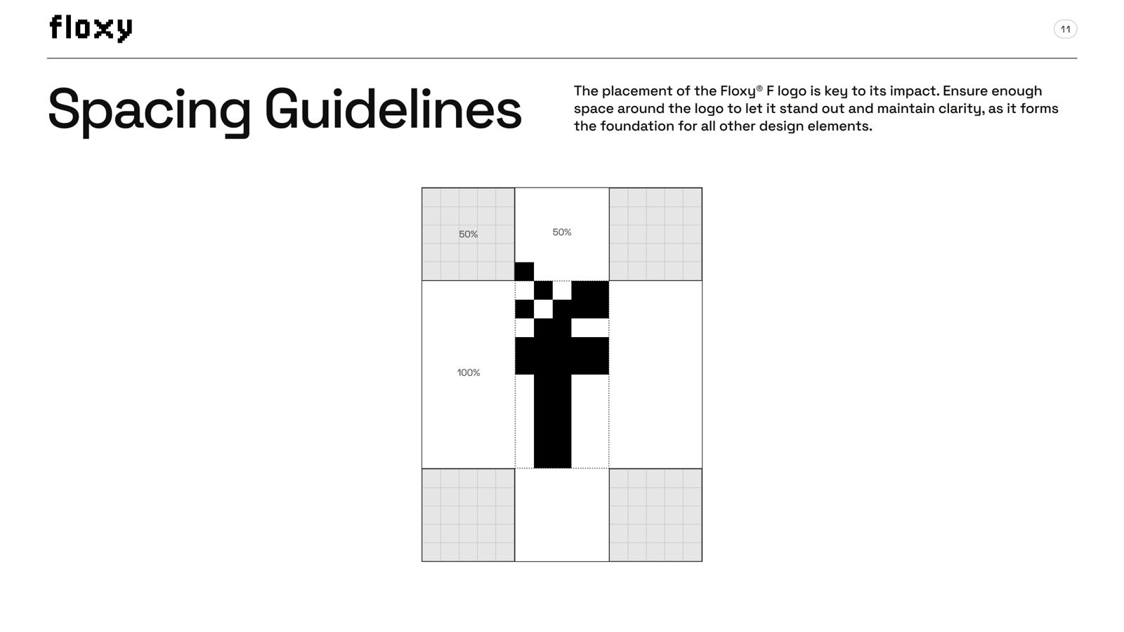
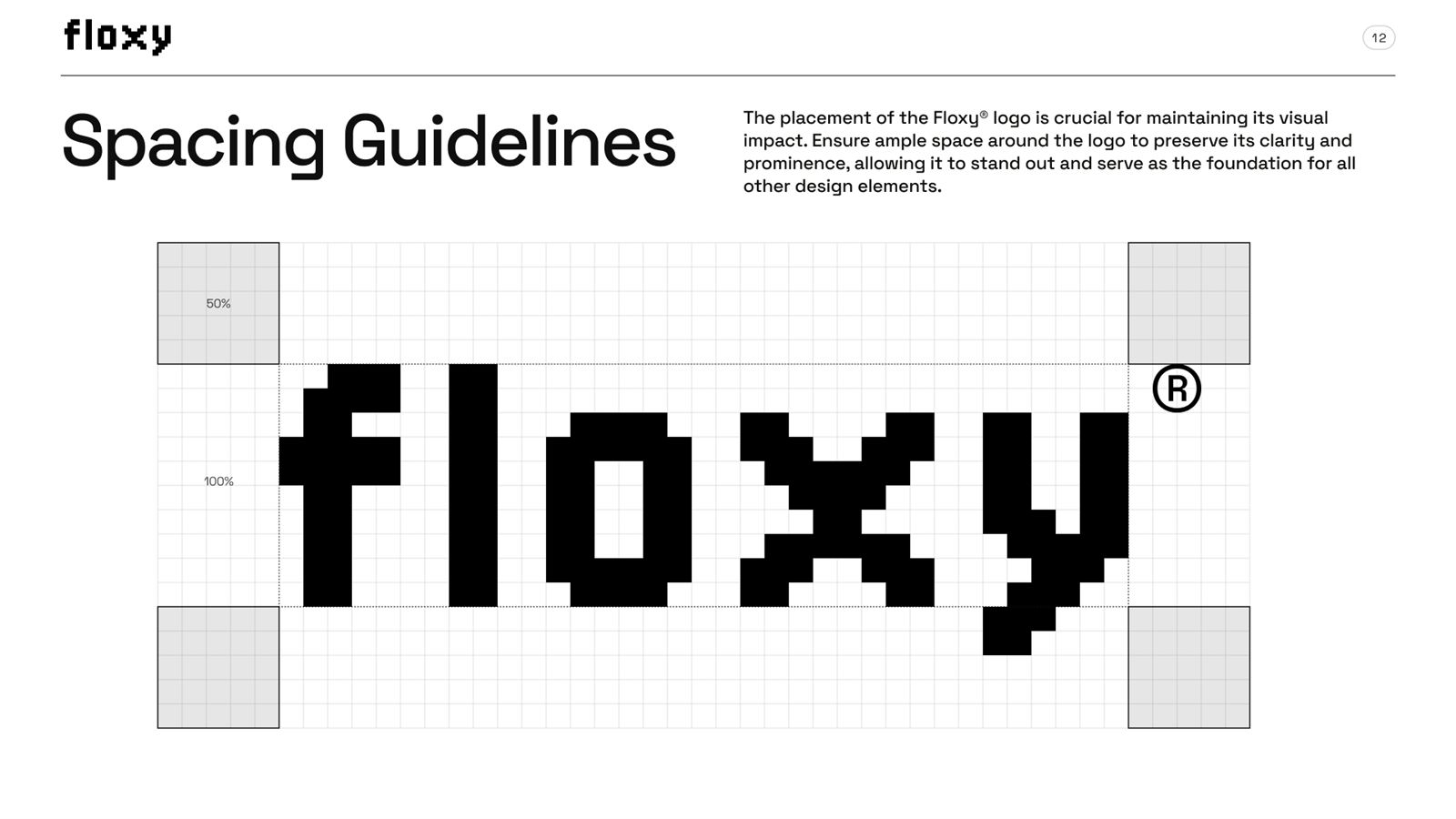
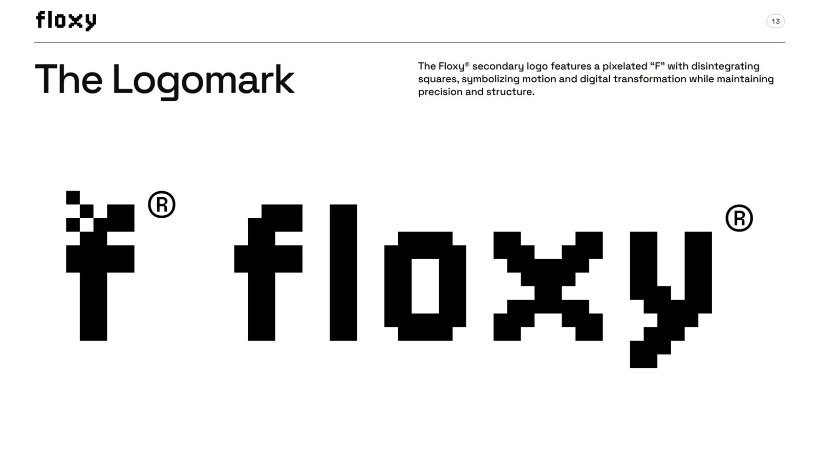
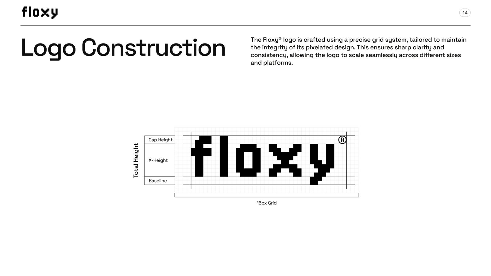
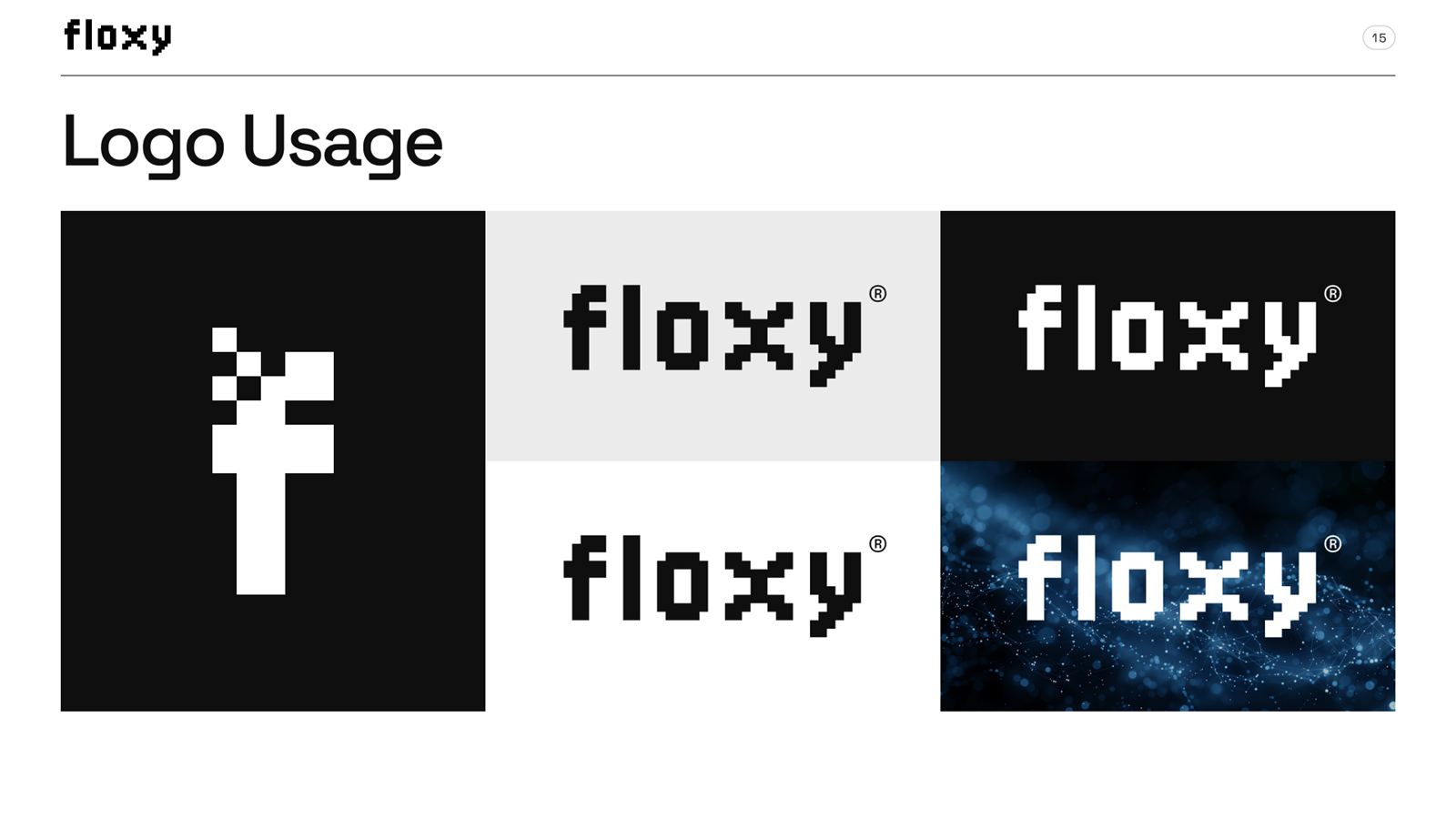
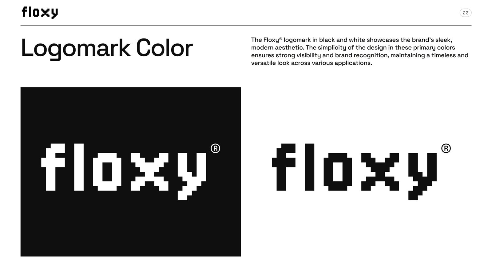
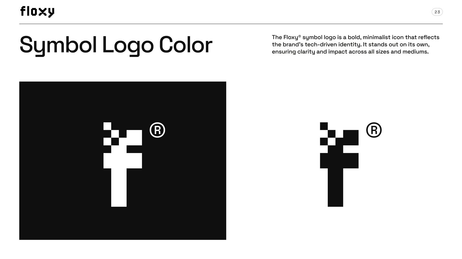
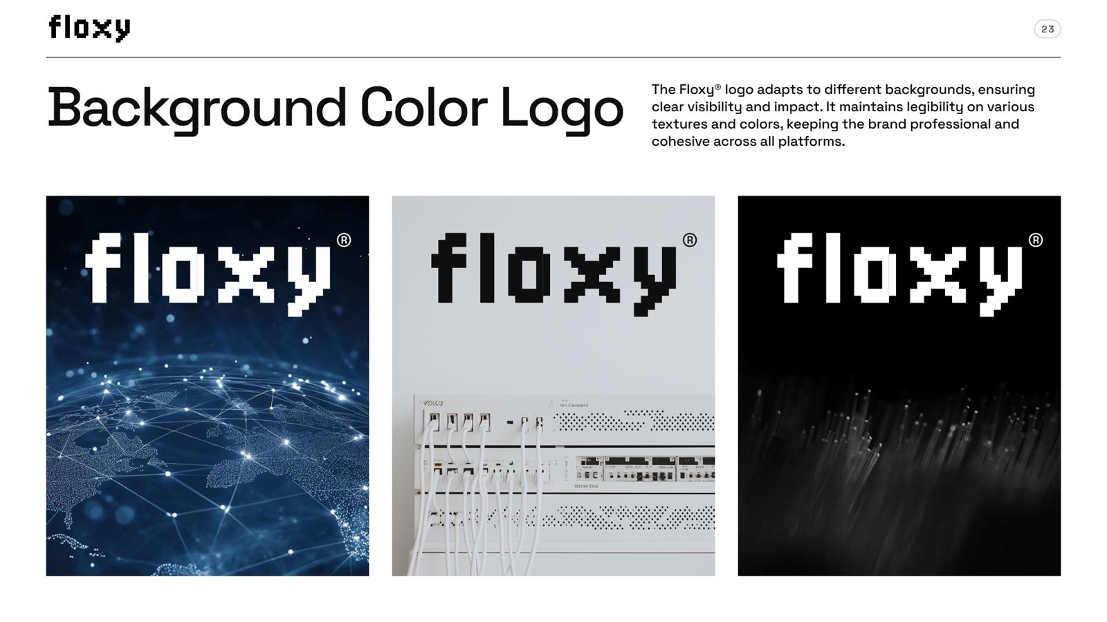
Construction, clear space, minimum sizes, placements and misuse. The pixel-built mark and every rule that keeps it recognizable at any size, on any surface.


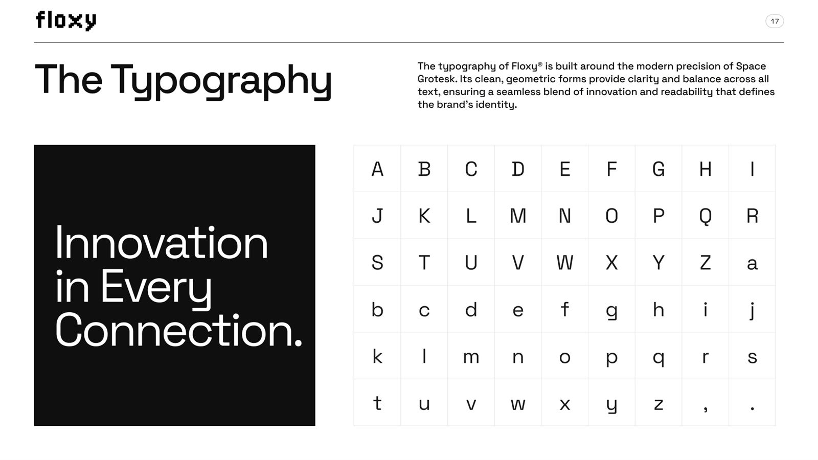
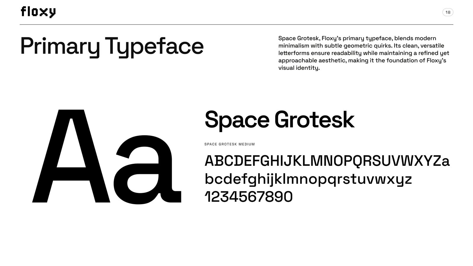
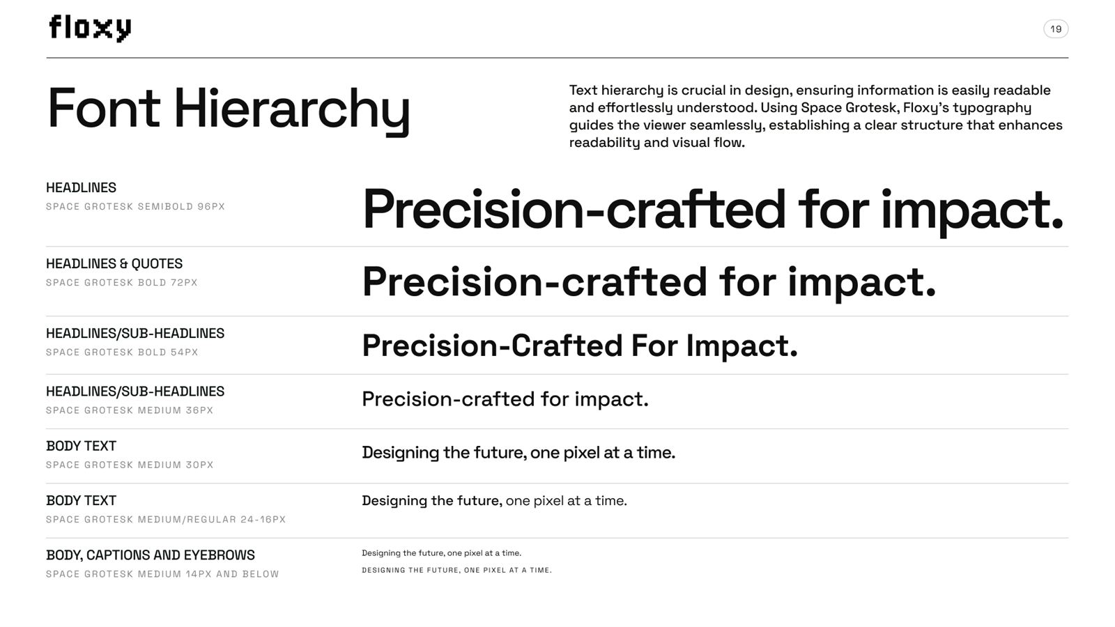
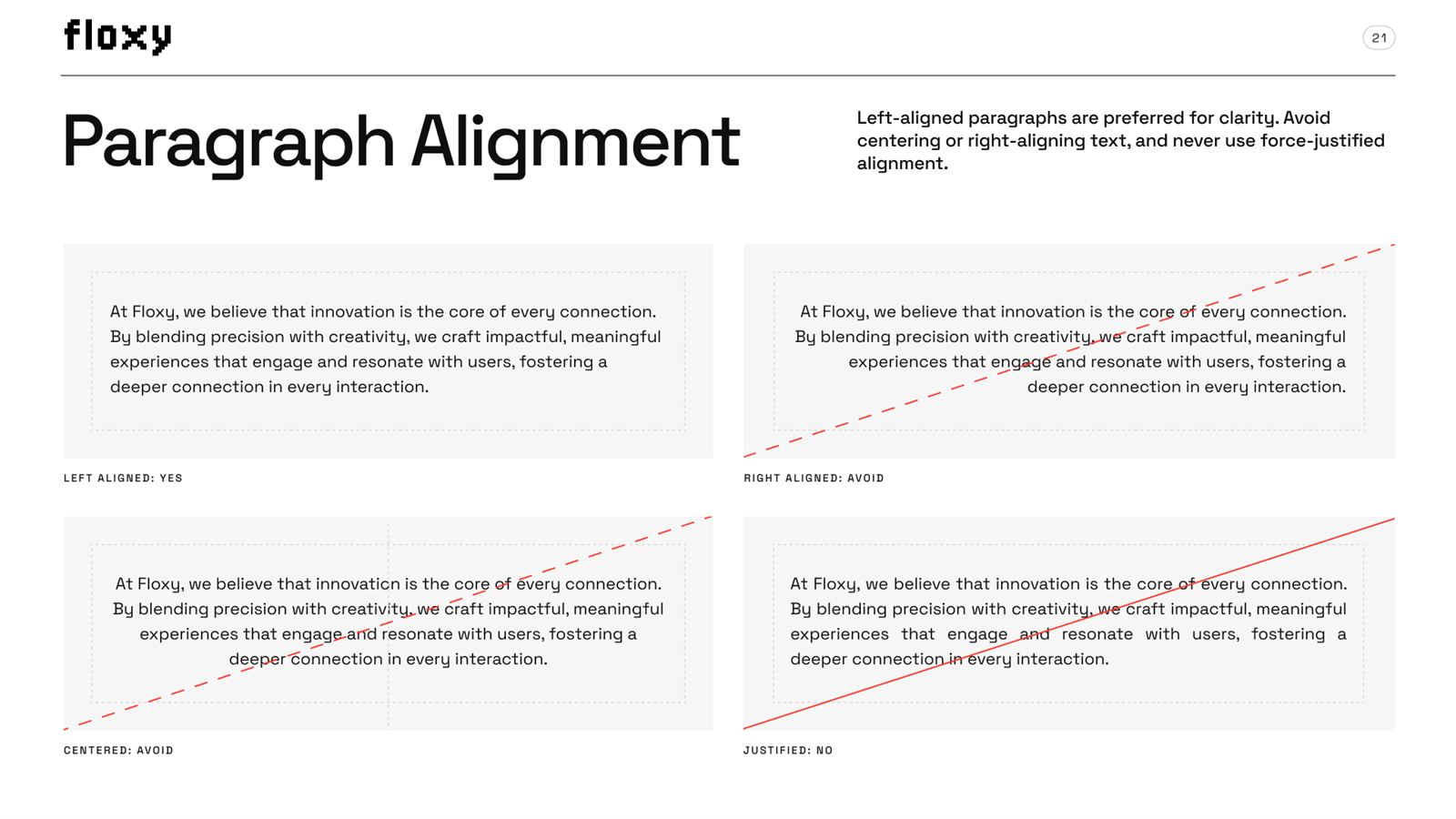
The typefaces, the scale, and the hierarchy rules that keep a headline sounding like Floxy whether it's on a billboard or a button.

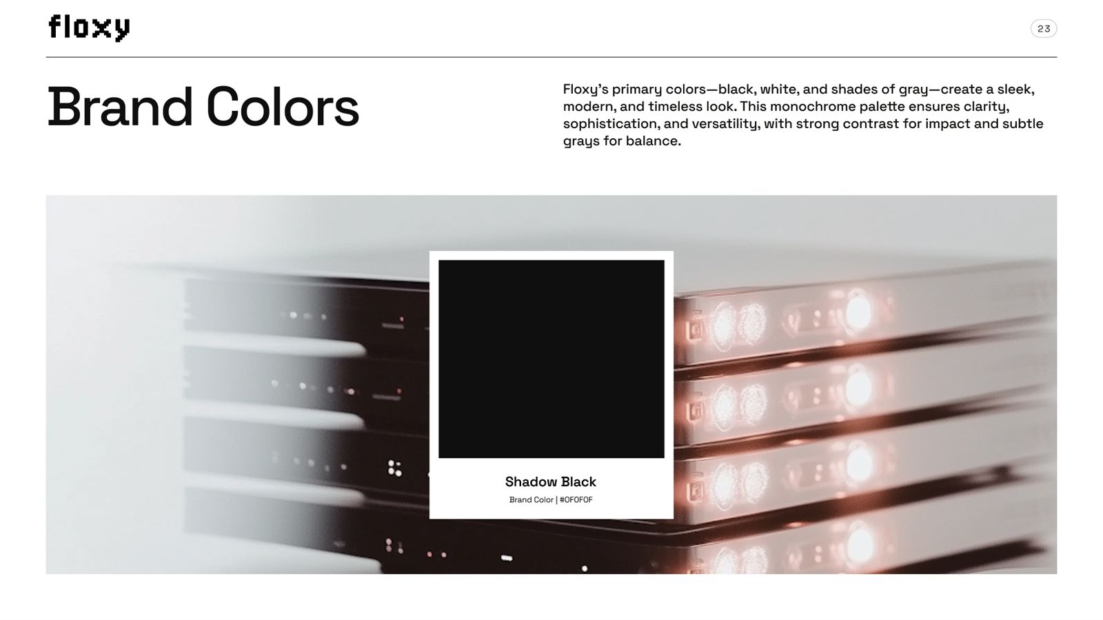
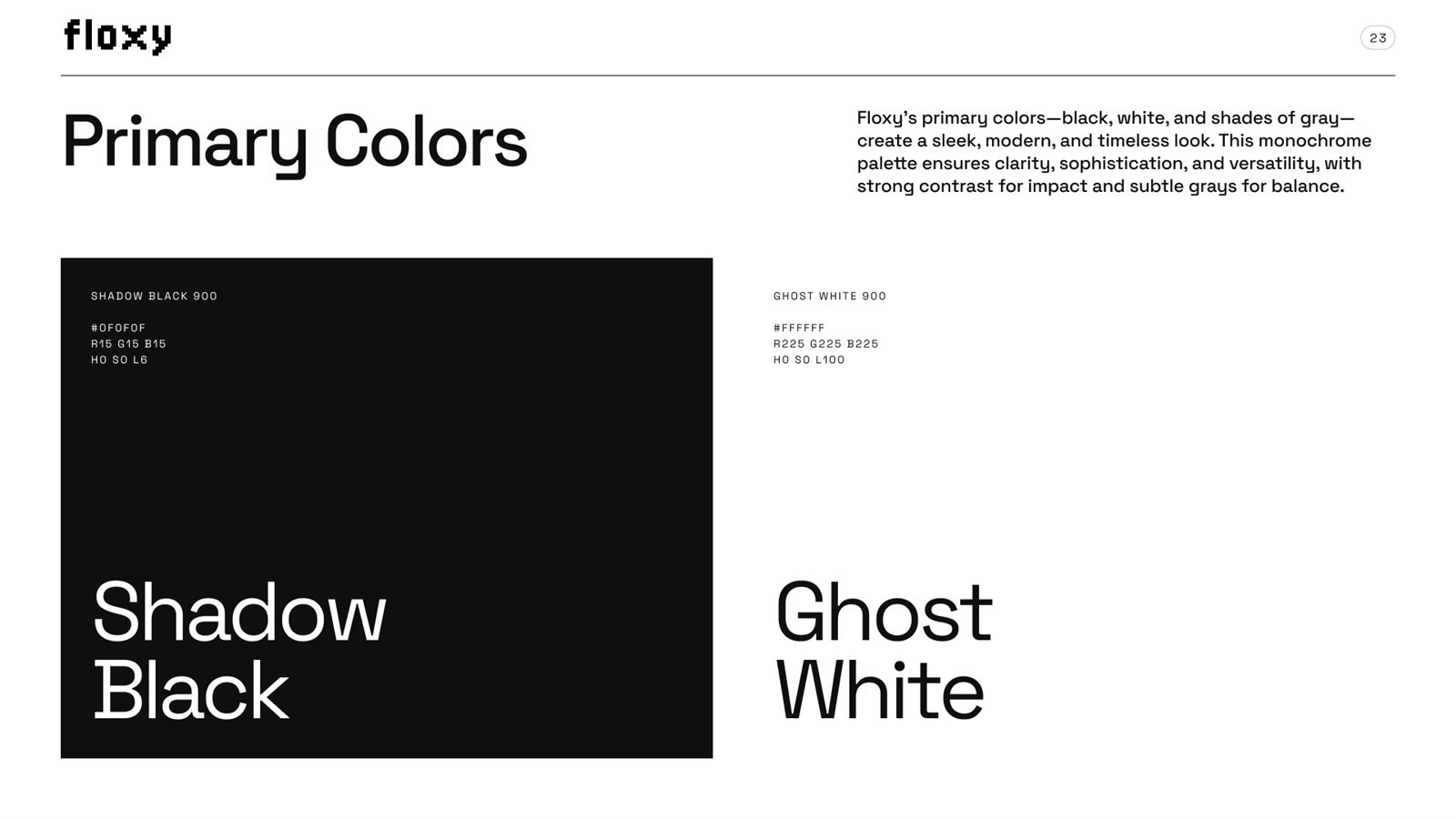
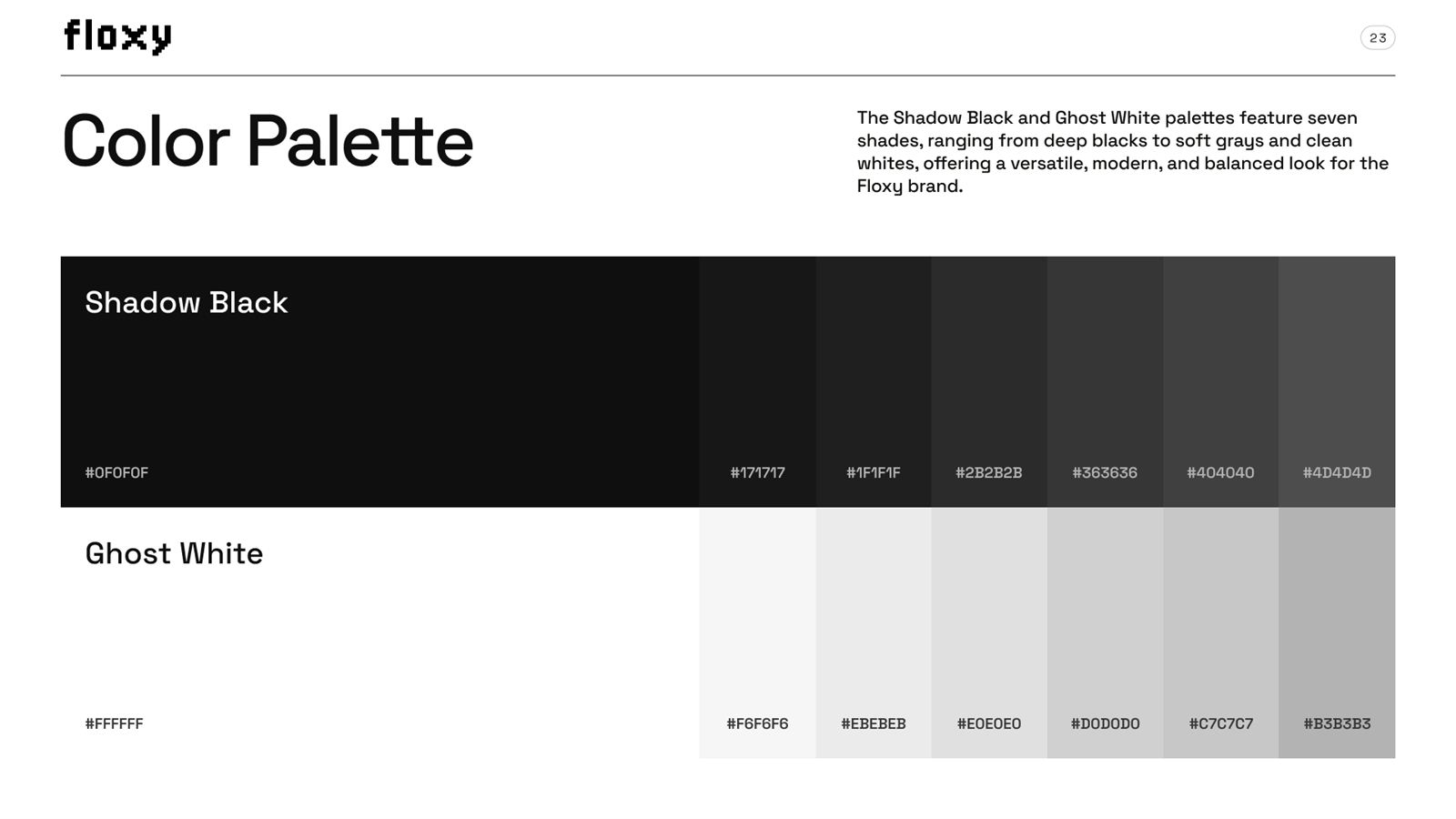
Shadow Black, white, and a disciplined gray scale. A monochrome system where every value has a job title, so the palette stays a system instead of a mood.


An icon family drawn to the same pixel grid as the logo, and the content rules: the voice that makes every caption unmistakably Floxy.

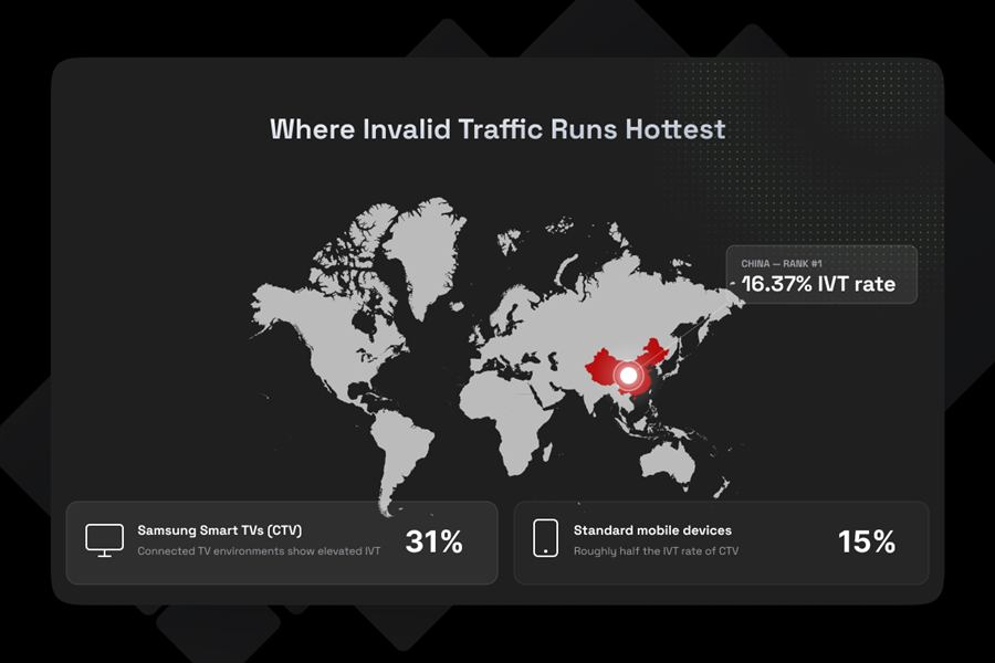
A brand book is only as good as its output. The same system, applied: data-story infographics designed for Floxy's content engine.
Building this book taught me more about restraint than any other project. I wrote about that lesson: What building a full brand guideline taught me about restraint.